
KMFDM
KMFDM just made history by remastering and re-releasing their entire catalog, and with my exciting new re-design, it's sure to be a hit.
KMFDM – Doin' It Again!
KMFDM had already built one of the most recognizable visual identities in industrial music, with decades of releases featuring BRUTE!’s unmistakable artwork. But as the band began remastering and reissuing its back catalog, all of those albums, singles and EPs needed a more consistent system to tie the collection together.
I came in to create that system without getting in the way of what already made the records feel like KMFDM. I developed a flexible approach to typography, layout, spines, discs, booklets and archival content that gave the reissues a shared visual language while still letting each release keep its own personality.
CLIENT
KMFDM Records
STUDIO
Weirdo Works
YEAR
2006
ROLE
Design system and art direction
Justin Gammon
ILLUSTRATION
BRUTE!
PHOTOGRAPHY
Various
RESULTS
Unified design standard across a 40+ release back catalog
22 covers redesigned, plus CD faces, liner notes, and credits
Still the standard on every KMFDM release, 20 years on
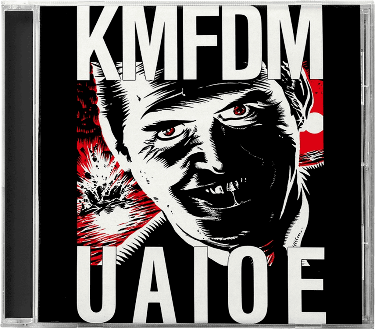
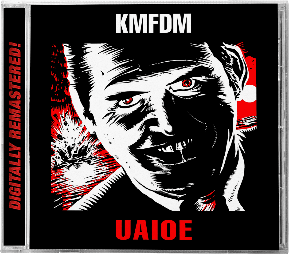
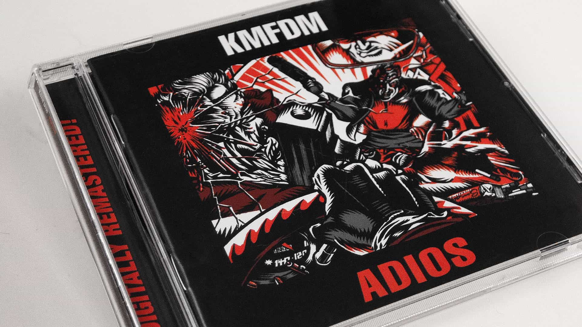
KMFDM | Remastered Album Cover Design
KMFDM had decades of albums, singles, EPs, live records, remixes and compilations behind them — all created at different times for different releases. The challenge was finding a way to bring that sprawling catalog together without losing the character of the original artwork.
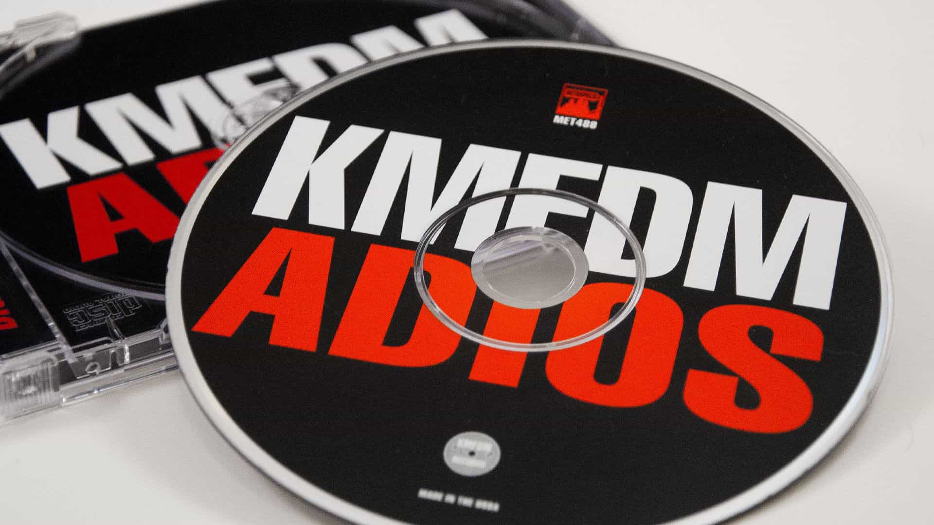
KMFDM | Remastered CD Design
KMFDM | Remastered CD Collection
From Chaos Comes Order
A System Built Around the Artwork
The artwork was never the problem. That was the part people already knew.
I built the identity around it — consistent typography, hierarchy, placement, color and information design that could flex from one release to the next. BRUTE!’s artwork could stay loud, strange and completely different every time, while the packaging around it quietly did the work of holding everything together.
I particularly like that last thought because it describes what you actually accomplished visually. Looking at the page, the covers clearly aren’t being forced into one rigid template. The framework is consistent; the imagery still gets to behave differently.
Iconic architecture expertly developed
Industrial Revolution
KMFDM’s Visual and Conceptual Continuity

What Do You Know, Deutschland?

Don’t Blow Your Top

UAIOE

Naïve
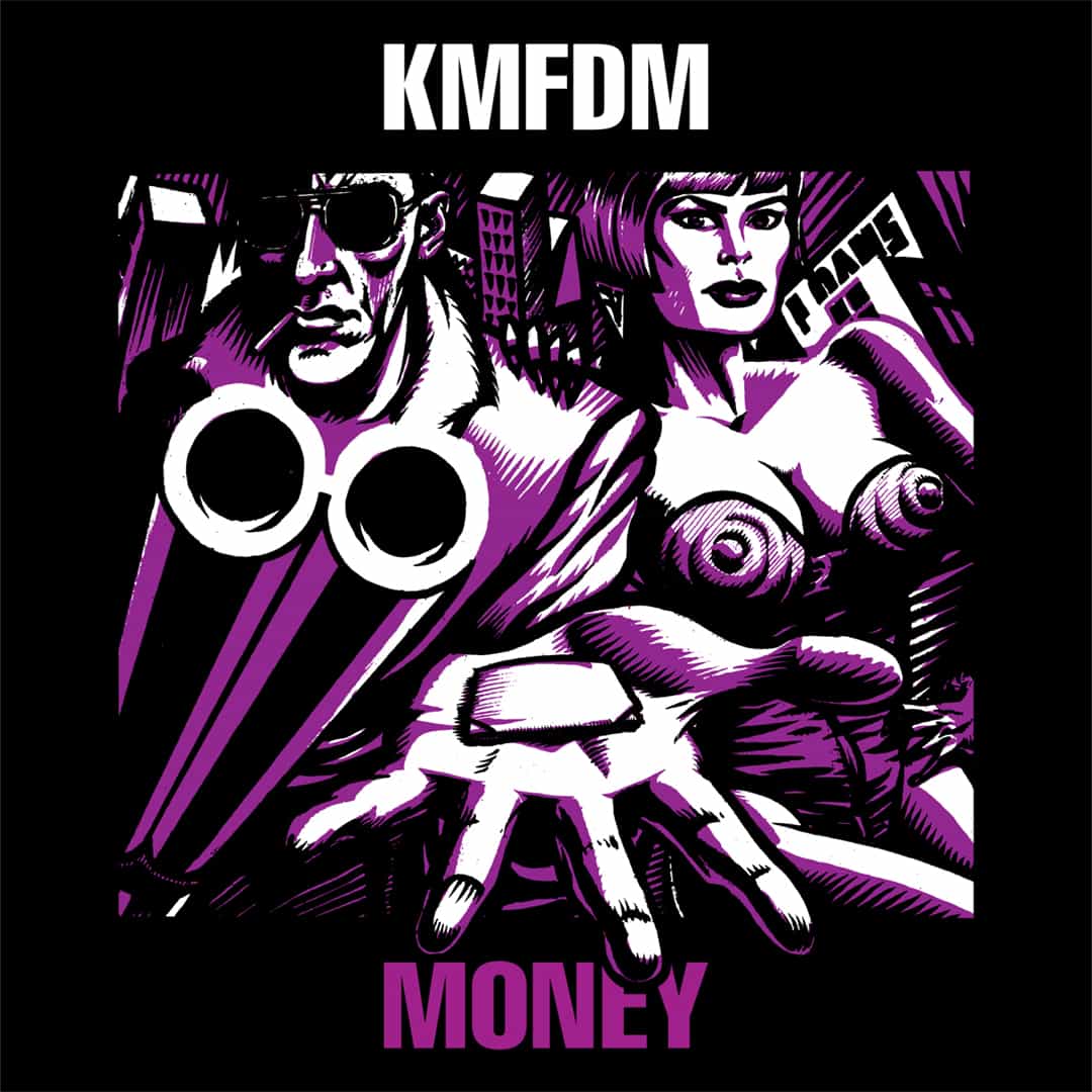
Money

Angst

Xtort
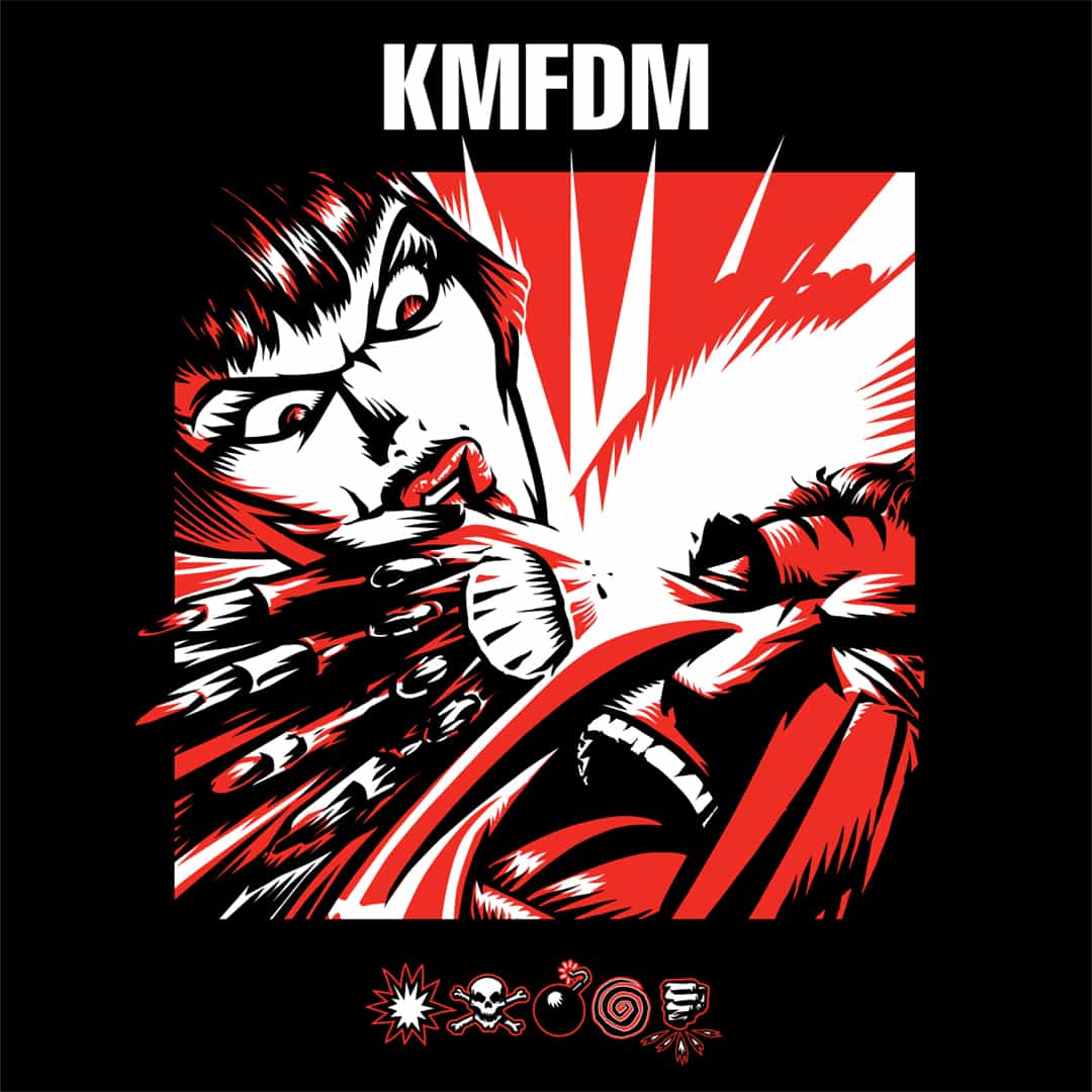
Symbols
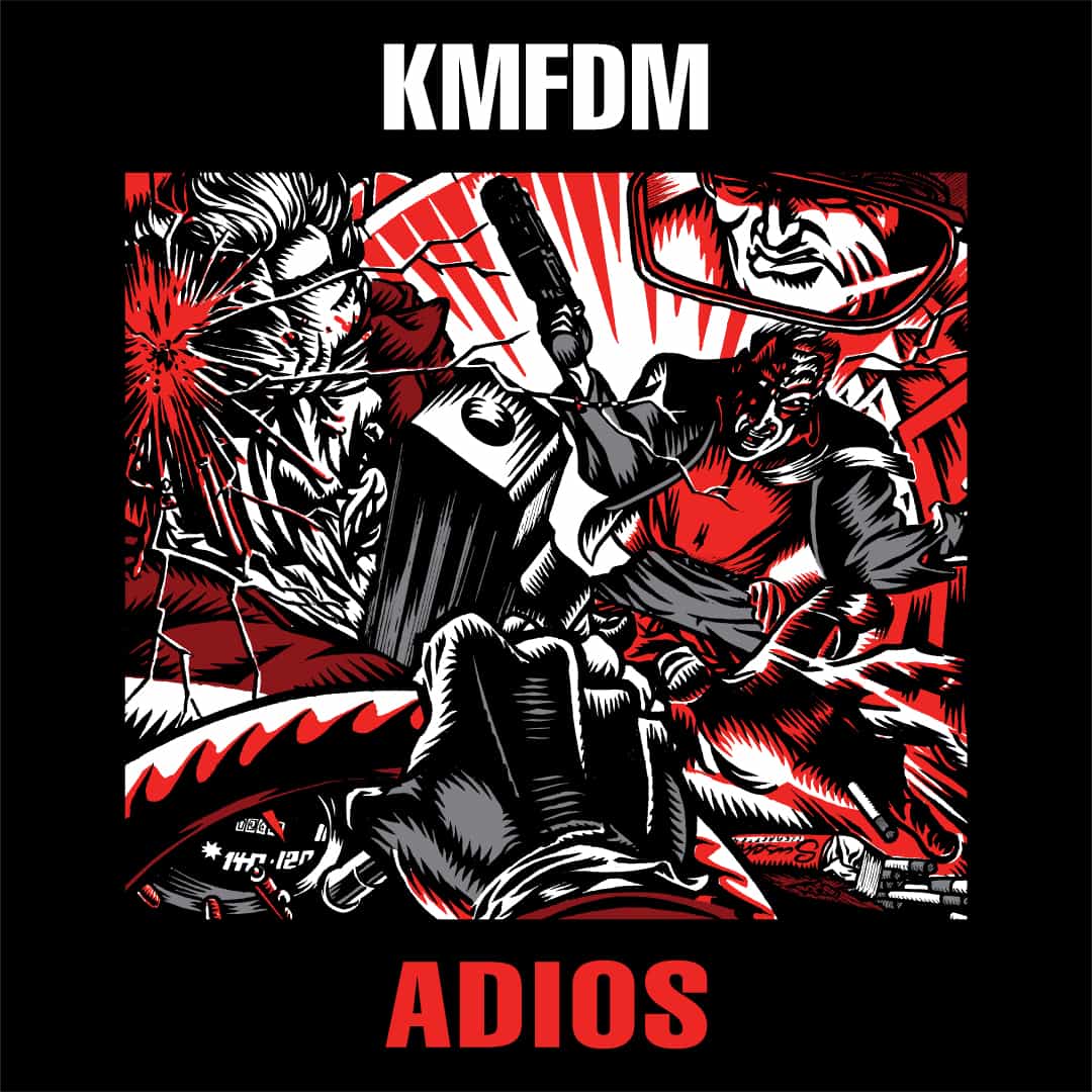
Adios

Hau Ruck
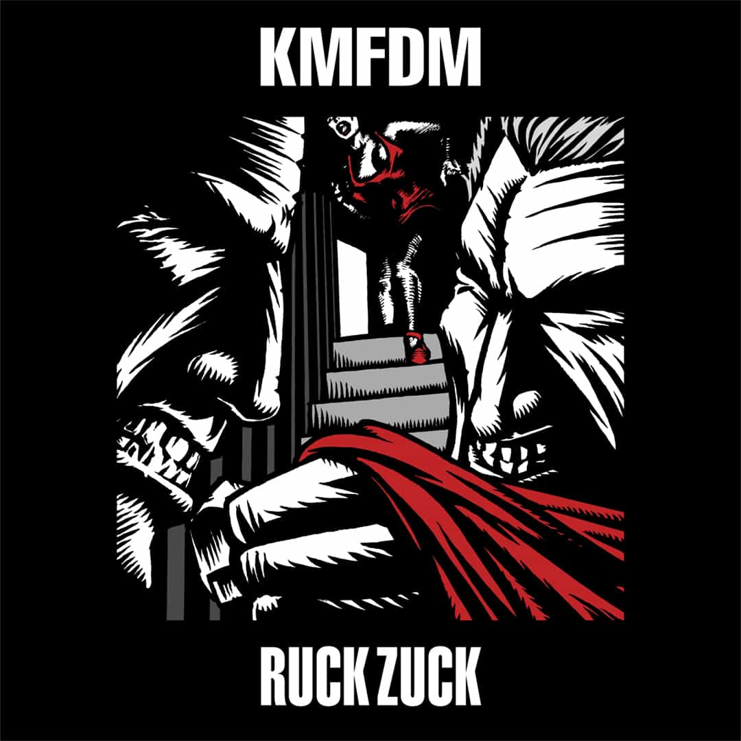
Ruck Zuck
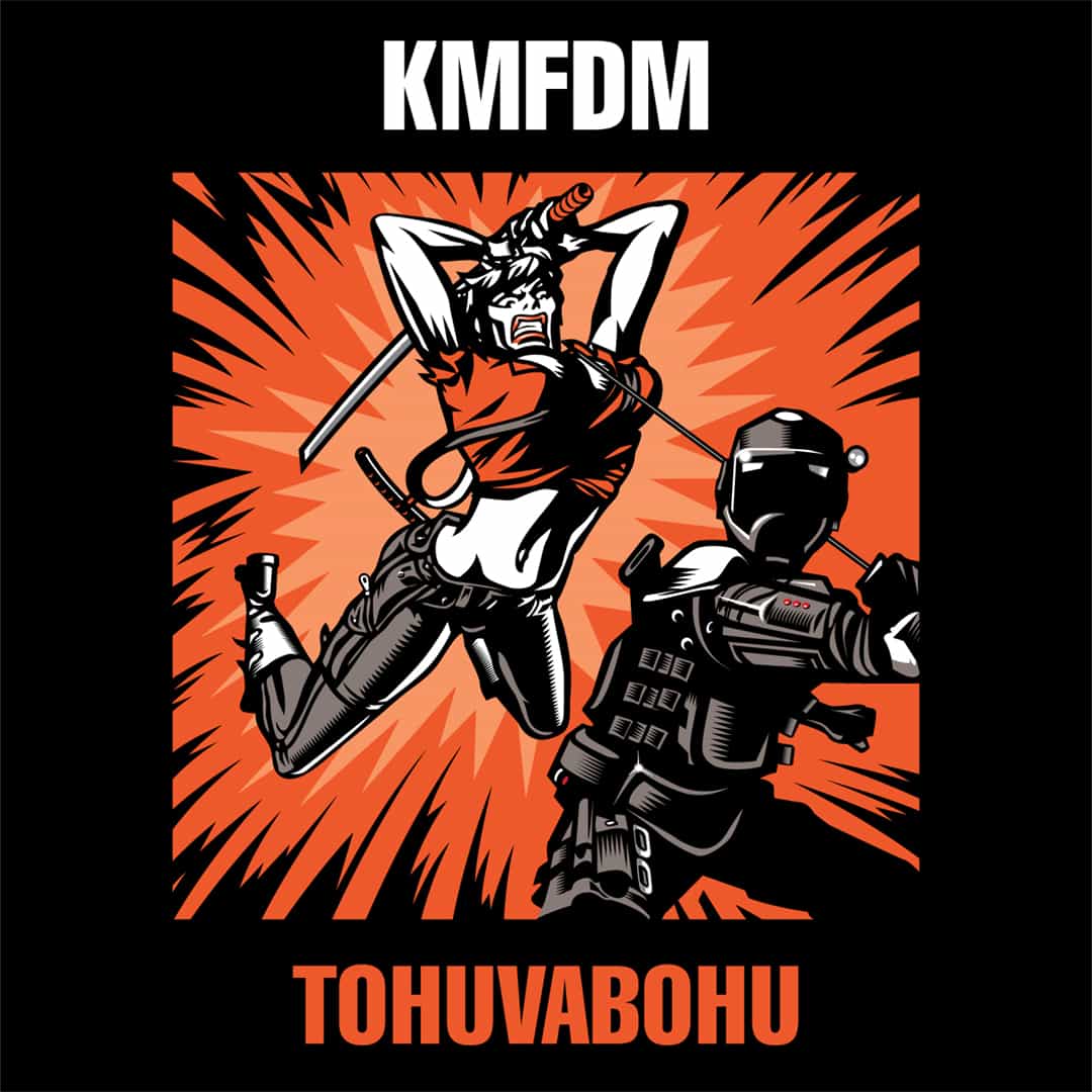
Tohuvabohu
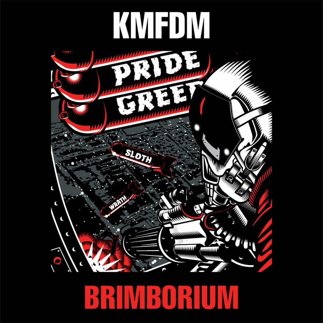
Brimborium
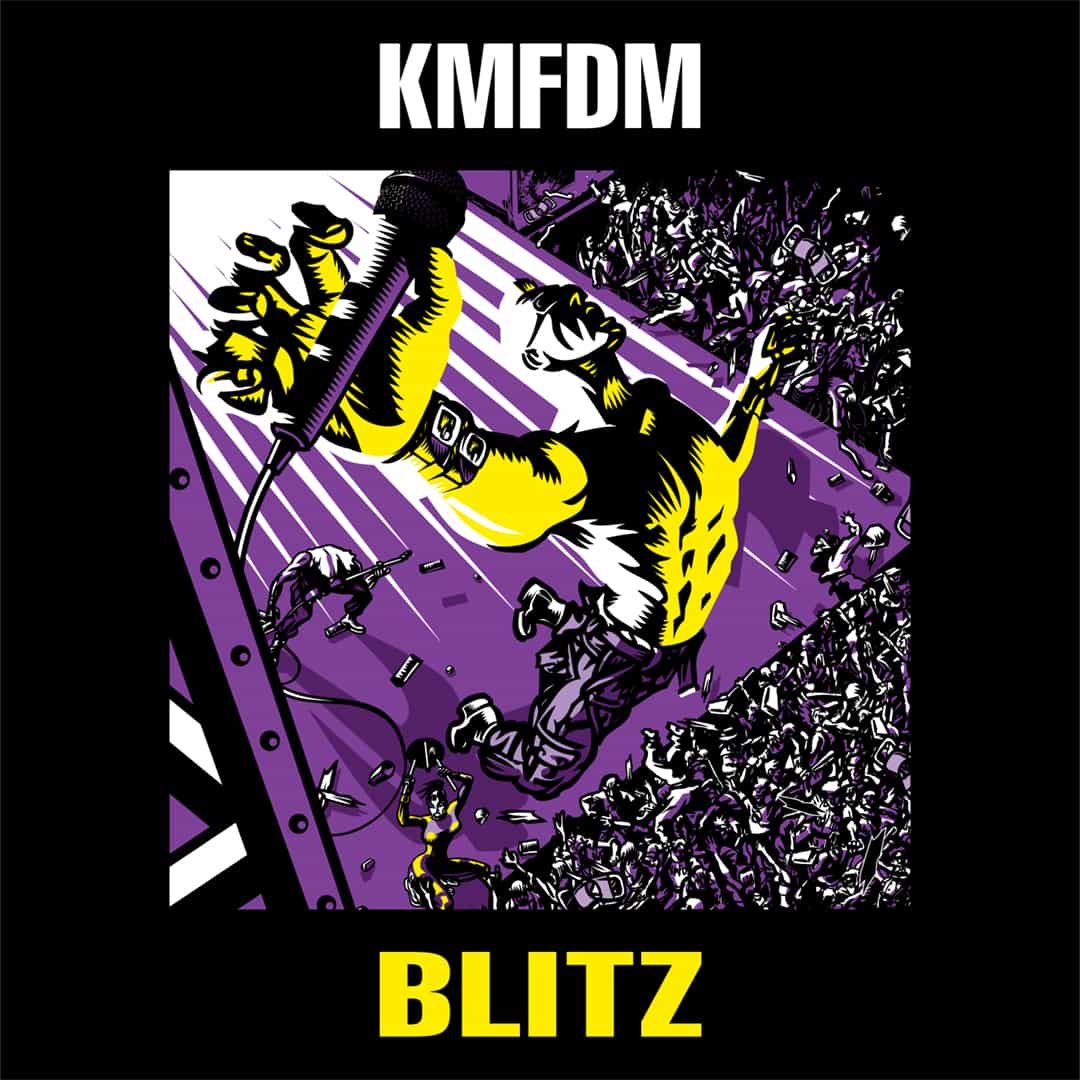
Blitz
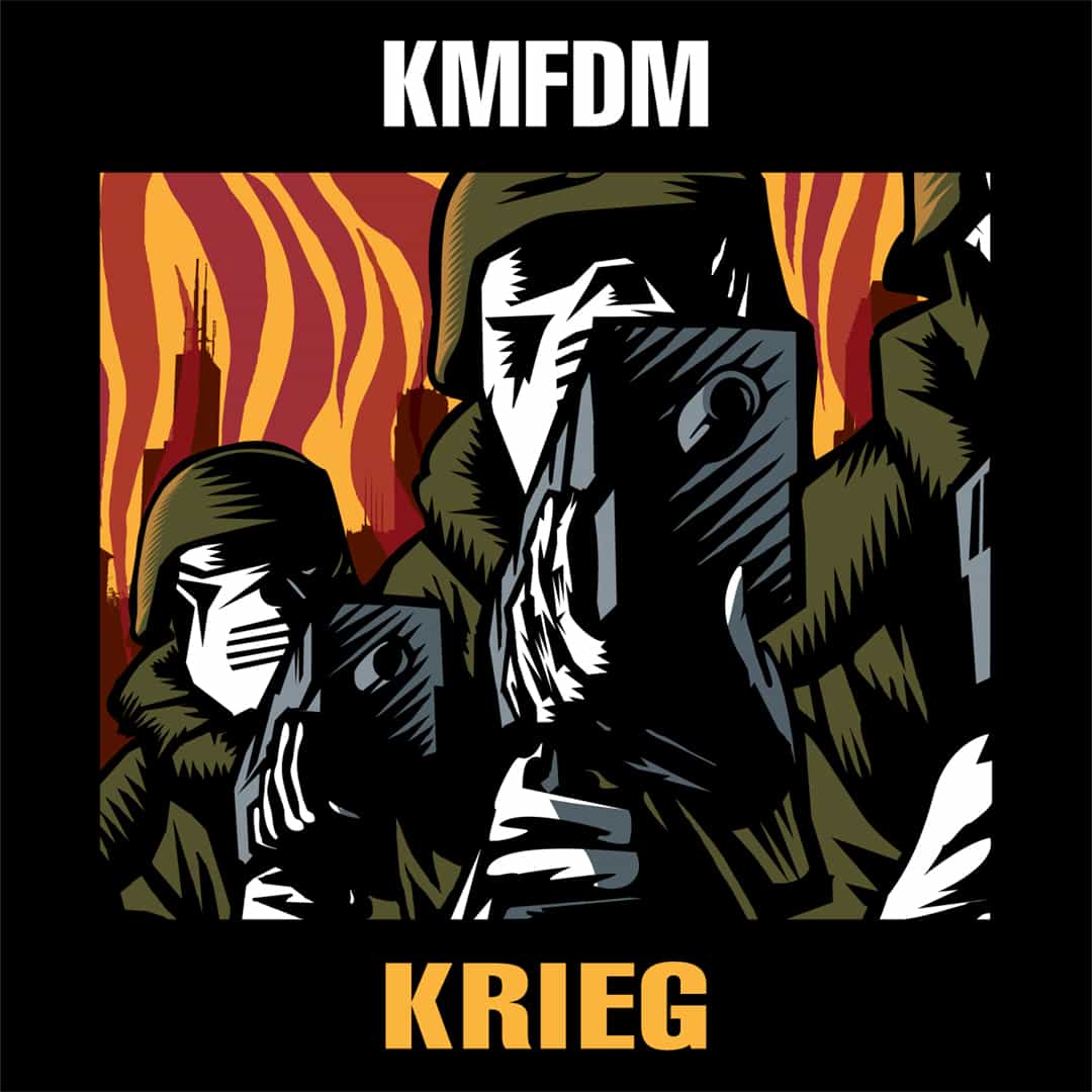
Krieg
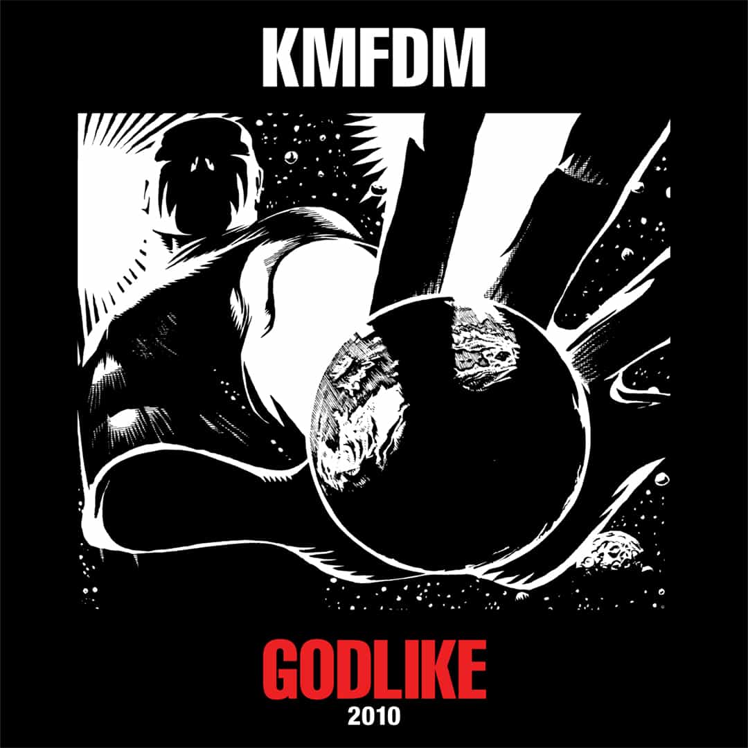
Godlike: 2010
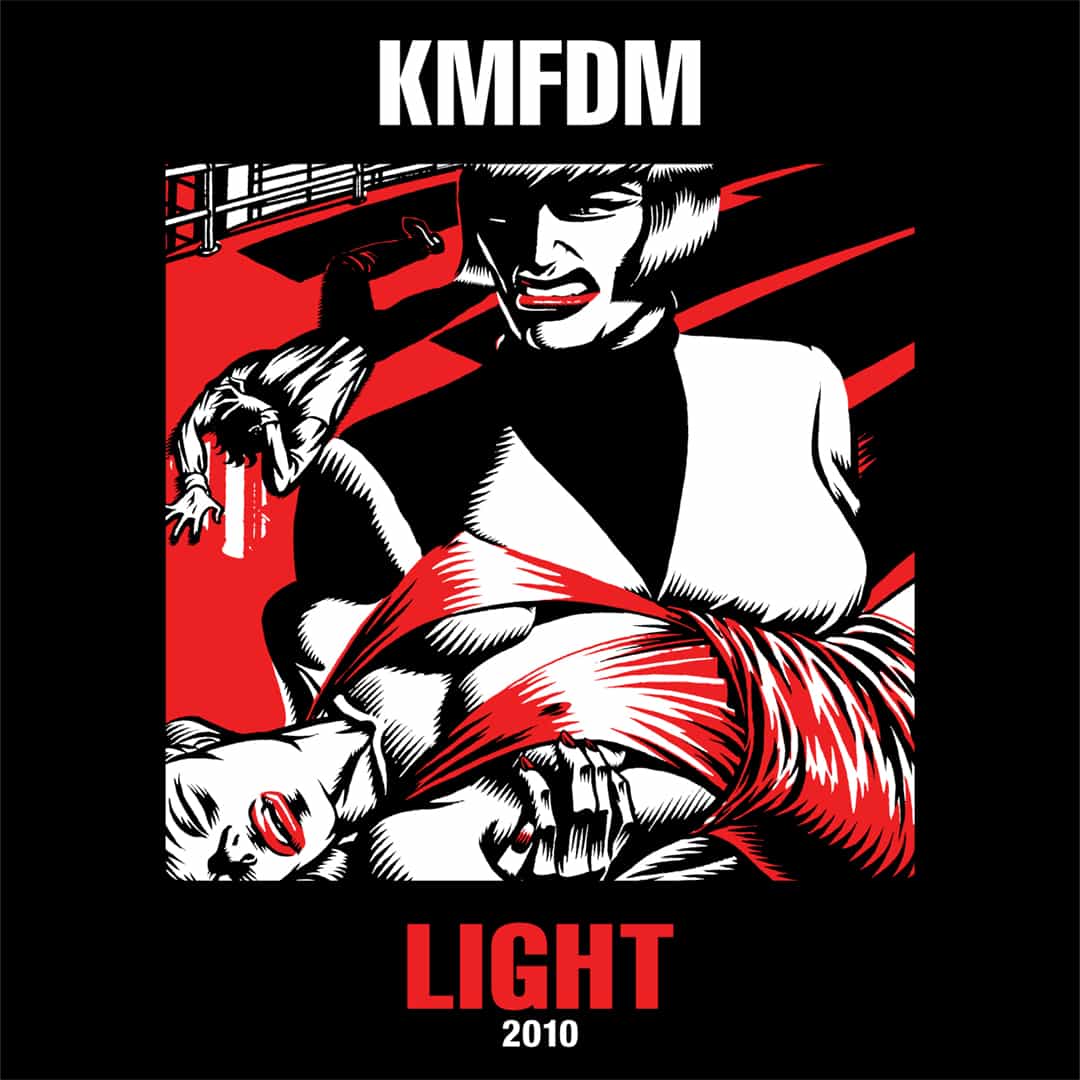
Light: 2010
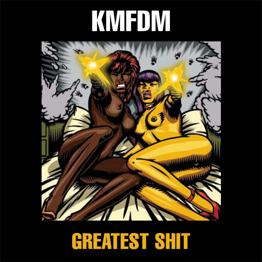
Greatest Shit
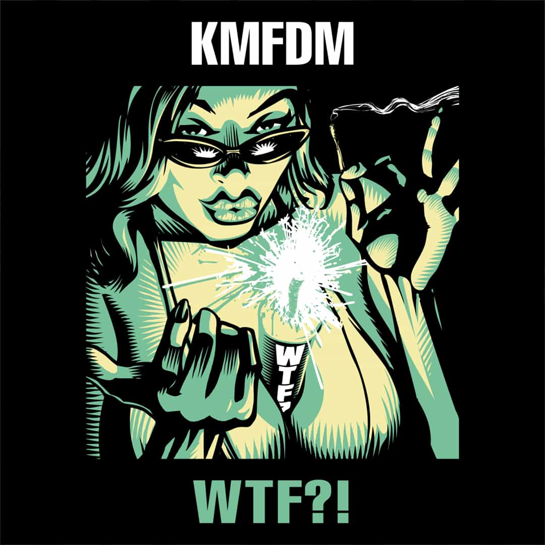
WTF?!

Amnesia
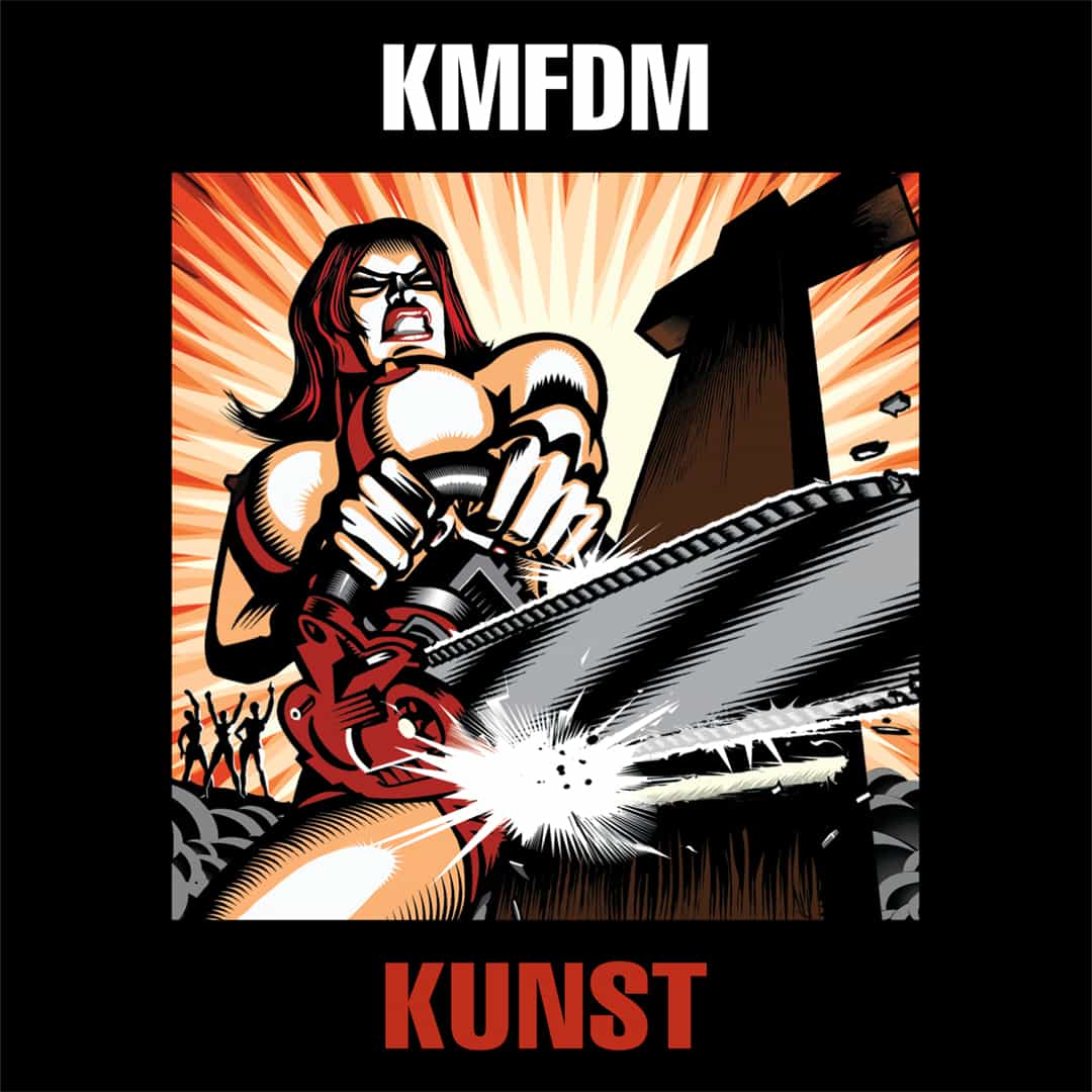
Kunst
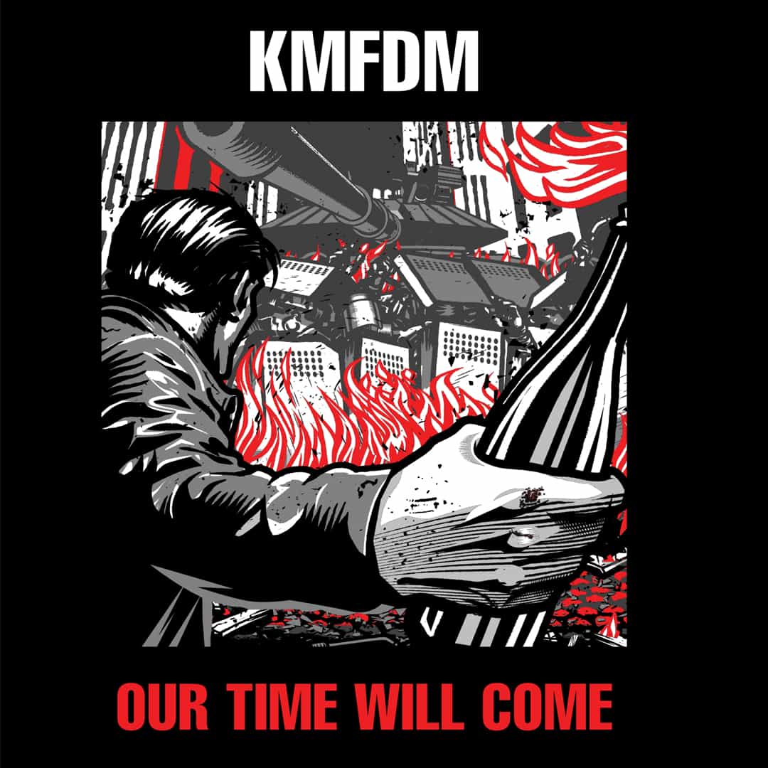
Our Time Will Come
In 2006, I built the visual system to make decades of KMFDM artwork feel like it belonged to the same catalog.
Two decades later, they’re still using it.

KMFDM | Remastered Album Liner Notes
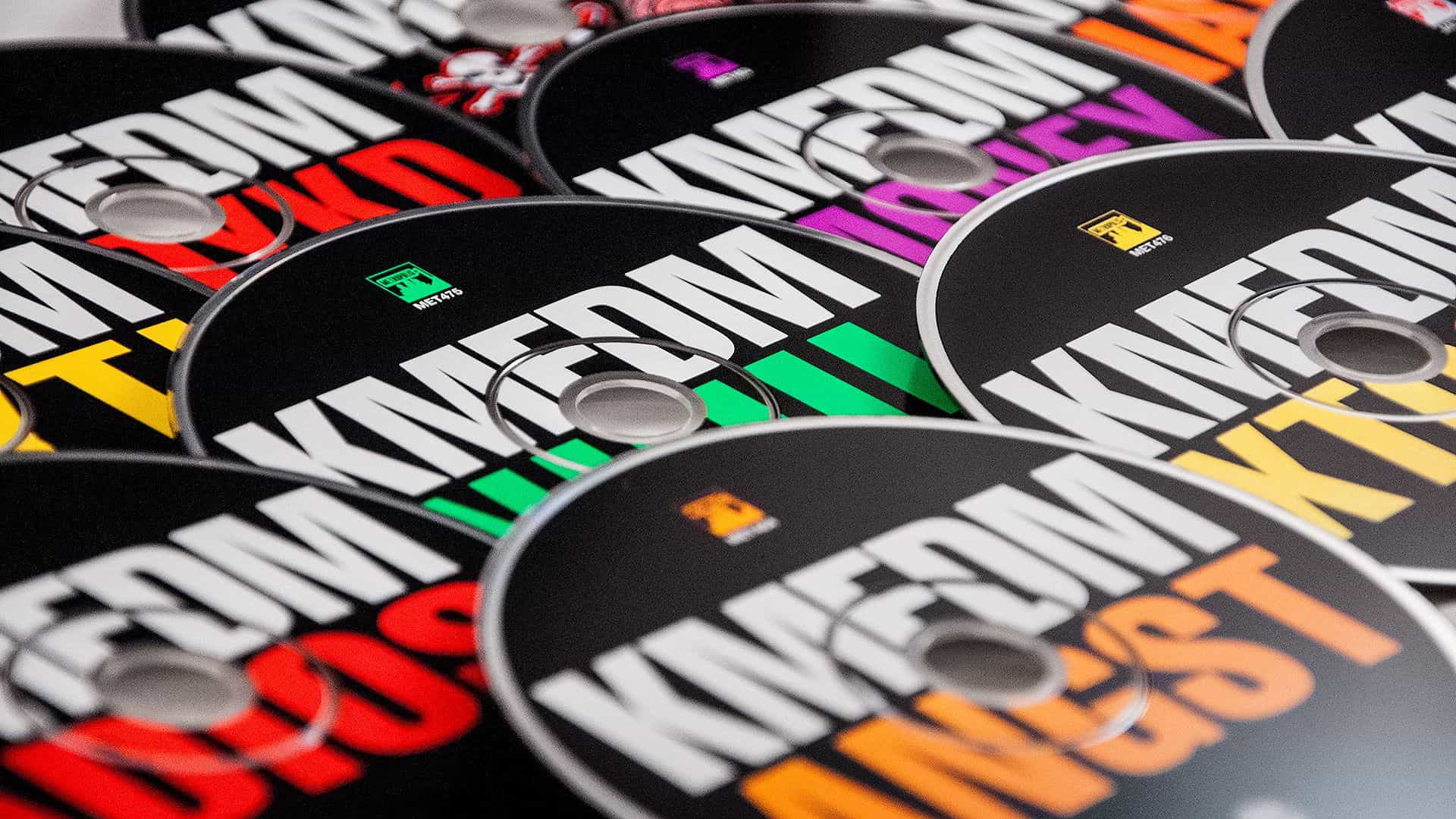
KMFDM | Remastered CD Disc Designs

KMFDM | Remastered CD Collection